Tokyo’s shopping district of Shibuya welcomed the opening of its new Tokyo Metro subway station in June 2008. As well increasing Shibuya’s connection to the city’s other attractions, including the two fellow shopping precincts of Ikebukuro and Saitama, the subway station stands as an architectural attraction in itself.
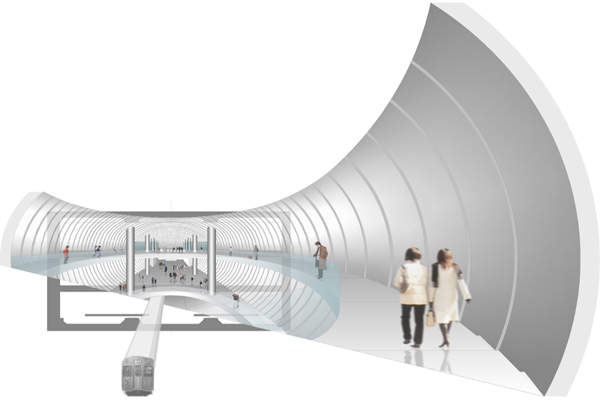
Designed by Japanese architect Tadao Ando, who won the Pritzker Prize in 1995, the station appears like an egg-shaped chichusen – meaning underground spaceship. Commuters must journey into the spaceship to reach their subway platforms.
A one-time boxer and truck driver, Ando is a self-educated architect known for minimalist, Brutalist concrete structures. In his Shibuya Station design for client Tokyu Corporation, he has used thick, empty, lightweight ‘bricks’ of prefabricated glass fibre-reinforced concrete (GFRC) for every surface: floors, walls, ceilings and columns. The smooth, grey walls of the 80m by 24m chichusen curve outward with a gentle radius.
Shibuya central atrium
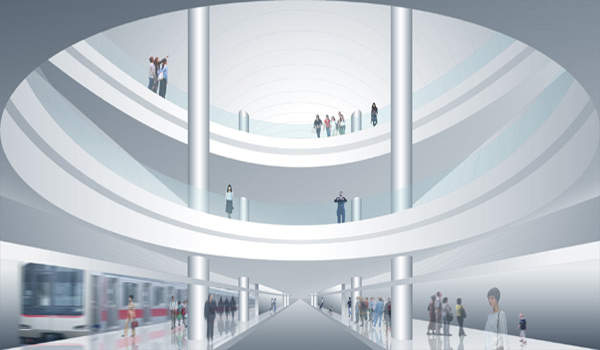
The ‘spaceship’ structure stretches over three main floors, and in its middle a covered atrium slices down, creating an open, airy feel. The central cut-out space has the shape of an elliptical funnel. The atrium opening is wider on the top floor than on the middle one, enabling people on upper floors to peer down the well toward lower floors, where the sightline grows narrower. One hones in on the bottom, where the trains run.
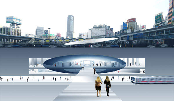
The architect wanted visitors to feel that they’re in a spaceship hovering over the tracks, and also let people experience a greater sense of connection between the lower and upper levels of the subway station – which are usually hidden from one another in the traditional subway layouts.
The 15m atrium visually connects the three floors: the top level (which is actually the ground floor), the middle concourse level B2 (the ticket gate floor) and the lowest floor B5 (the platforms, located 30m below ground level). Columns soar from the middle floor to the uppermost ceiling, enhancing this sense of unification between levels.
The atrium is designed to give visitors an overview of the station, letting them know where they are at all times. This is to avoid the sense of disorientation commonly experienced in many of Tokyo’s windowless and hard-to-navigate subway stations.
The elliptical shape allows for the smooth flow of human traffic, which is estimated at 400,000 commuters on an average weekday. The Shibuya
train station in total sees 2.4 million visitors each weekday.
The openness of the space also gives a dynamic appeal to the environment. As visitors take in a cross-section of the busy station, they spot people zipping back and forth on all levels, as well as trains moving at the bottom.
Environmental highlights
Ando’s architecture is known for incorporating natural elements, such as light, water and wind. Accordingly, Shibuya Station incorporates a world-first in subway ventilation strategies, whereby the hot air produced by the trains flows up through the central atrium and out into the open air. Counterpoint to this, cool air from outside flows down into the space providing natural aeration.
Water pipes lining the outer shell of the ‘spaceship’ and underneath the platform circulate water, which creates a cooling effect and further reduces the station’s reliance on air conditioning. Indoor trees provide additional cooling and add an aesthetic freshness uncommon to conventional subways.
Fukutoshin subway line
This station is part of the new 20.2km Fukutoshin subway line (the 13th Tokyo-area subway line), created to relieve congestion on the city’s crowded Yamanote line. Until 2012, the new station will serve only the Fukutoshin line. After that, the station will also accommodate the Toyoko line, which currently runs through the old Shibuya Station.
The subway station lies under Meijidori (Meiji Street) near the site of the old Tokyu Bunkakaikan (Tokyo Cultural Centre). Built in 1956 and demolished in 2003, Tokyu Bunkakaikan had featured a planetarium and a theatre multiplex. The centre had sparked people’s imaginations and stood as the symbol of Shibuya.
In designing the subterranean spaceship, Ando wanted to capture people’s imaginations in a similar way by creating an innovative structure that symbolised the entrance to the revived region of Shibuya.
The subway station and Shibuya train station vicinity are part of a larger development plan by the Tokyo Metropolitan Government, which will see Shibuya transformed into a cultural and artistic hub.


