How many internationally acclaimed architects does it take to change the face of boutique hotel design? Answer: 19.
It sounds like the punchline to some sort of industry joke, but at the Silken Group’s Puerta America Hotel in Madrid the answer is no laughing matter.
Silken’s Juan Valls takes up the story: ‘we initially wanted to call in four or five internationally renowned figures. Then one thing led to another and the field expanded.’ Silken enlisted the likes of Zaha Hadid, Ron Arad, David Chipperfield, Norman Foster, Jean Nouvel and Marc Newson; a dream team made up of the biggest names in design and build – Real Architecture anyone?
The Puerta America’s location is either handy for the airport or a suburban enclave on the edge of a busy motorway, depending on your point of view. The external structure was developed by SGA Studio, headed by Felipe Saez de Gordoa, and is fairly standard airport hotel fare: an unobtrusive rectangular tower block.
DESIGN FREEDOM
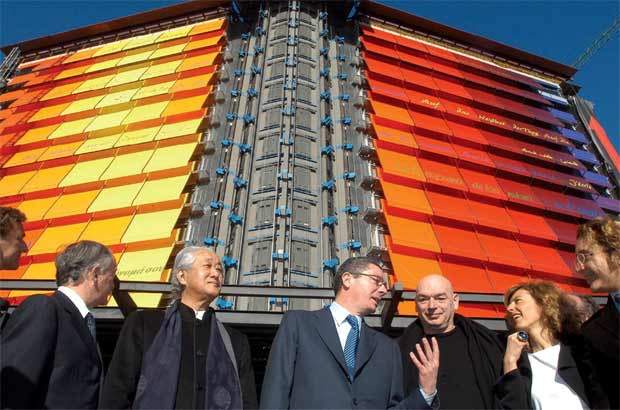
The first real sign that there is something special going on is the cladding, devised by French architect Jean Nouvel, who exchanged the ordinariness of the exterior for a series of PVC blinds ranging in colour from yellow to red and orange to purple. The blinds are adorned with the words of Paul Eluard’s poem ‘Freedom’ in several different languages, hinting at the diversity of design within.
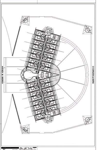
The main entrance is a raised orange pathway, slightly lower than street level on the Avenida de América side of the building. Service access is located on Calle Corazón de María.
‘The hotel structure has a characteristic dihedral shape of 14 floors, with two adjoining cylindrical bodies on the ground floor: the covered entrance at the front and the back,’ adds Saez de Gordoa.
Each of the 12 floors measures 1,300m², and the only constraint was that each had to contain 28 rooms and two junior suites, with the exception of the top floor, where Jean Nouvel has designed 12 luxurious suites. Otherwise, all the design practices involved were encouraged to showcase their architectural skills without restraint, and the results show plenty of imagination and flair.
FIRST IMPRESSIONS
The main reception area, designed by John Pawson, is in keeping with his trademark minimalist style. The 150m² area is covered in large, curved wooden panels, creating what Pawson calls ‘a space of peace and quiet in the heart of the hotel’, where the frazzled business traveller can check in.
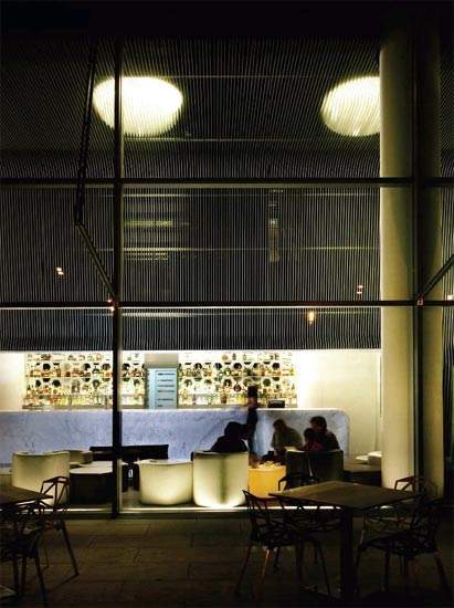
Marc Newson, the man responsible for Ford’s Tango coloured concept car, has made a characteristically bold use of colour and texture in the adjacent bar. The space, which opens out onto a terrace, is dominated by 400 laser-cut sections of aluminium, which wrap around the walls and ceiling.
The 8m-long Carrara marble bar is surrounded by white leather seating, and the mirror-like finish of the polished marble floor makes it perfect for guests who want to ‘see and be seen’.
On the other side of the floor is the Lagrimas Negras bar, designed by Christian Liaigre. The monochrome colour scheme creates a striking look, particularly on the backlit bar, which is made of acrylic stone LG HI-MACS, decorated with abstract motifs representing different regions of Spain. Meanwhile, guests using the underground car park can enjoy Italian architect Teresa Sapey’s large-scale graphics in vibrant colours.
MAKING LIGHT WORK
Zaha Hadid’s contribution to the project is all clean lines and sensuous curves. The lobby area contains a variation of the Iraqi-born architect’s colour-changing Vortexx light, developed for Italian manufacturer Sawaya & Moroni.
In the bedrooms, LG HI-MACS makes another welcome appearance, creating seamless joins between the bed and the furniture, while in the bathrooms the fluidity of the design merges the bathtub with the sink. Each room also features strips of LEDs that can transmit requests for breakfast or to be left alone at the touch of a button.
‘We took the opportunity to create a new domestic language of architecture, driven by new developments in digital design and enhanced manufacturing capabilities,’ explains Hadid. ‘This new dialogue emphasises the complex and continuous nature of the design and the merging of disparate forms and textures.’
URBAN SANCTUARY
Norman Foster may continue to pursue his dream of high-tech architecture in other projects, but he has designed this space to be ‘the perfect urban sanctuary’, in collaboration with his friend, the Basque sculptor Eduardo Chillida, whose work greets guests in the second-floor lobby.
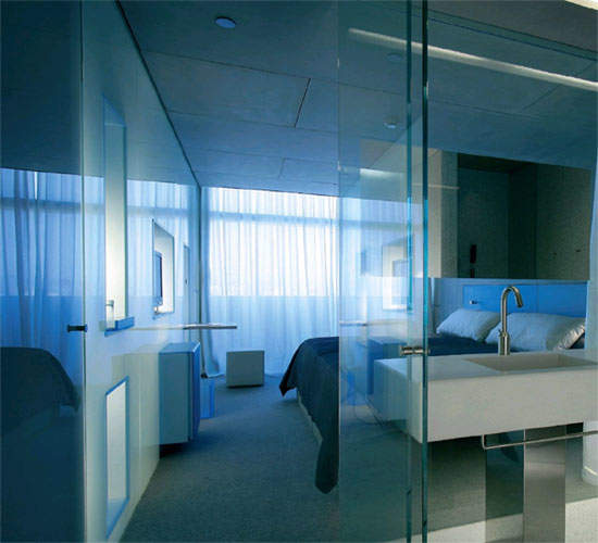
The hallway is interspersed with backlit translucent glass screens, each of which forms the back wall of a bathroom on the other side. The screens’ futuristic look contrasts with the warmth of the off-white leather wall sections.
Similarly, the bedrooms encompass everything from brown leather headboards and oak flooring to a cool backlit onyx counter and a backlit stretched canvas on the ceiling of the bathroom.
COOL AND CALM
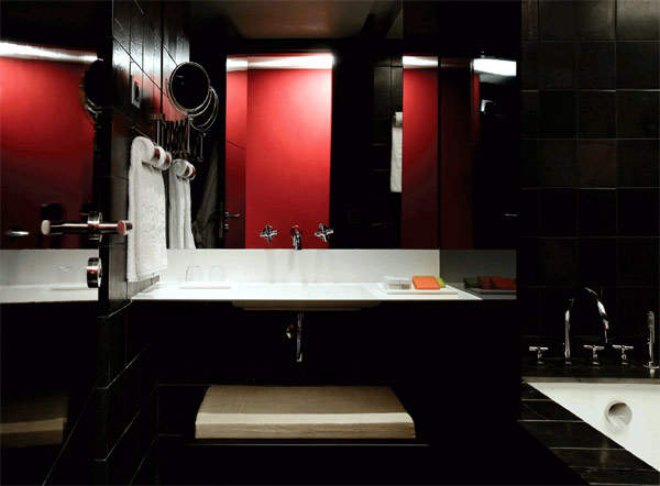
David Chipperfield has taken a monochrome approach on his floor. Triangular light bands give the corridor an almost supernatural appearance. In the rooms there is a very precise use of space, and the entire floor is made up of 7cm x 21cm, hand-cut pieces of terracotta. The desk is the same length as the bed and has the same proportions as the tiles, continuing the geometric theme. Meanwhile, the marble slabs used in the bathroom have an almost clinical feel.
Chipperfield himself calls it: ‘an atmosphere of quiet luxury, an intimate environment where you can enjoy the qualities of the rich materials that line the space. We wanted a room reduced to its essential components, affording each element a certain generosity and importance.’
Featuring Chipperfield’s own bathroom fittings for Czech and Speake, door handles for Valli and Valli, and corridor lighting for Fontana Arte, the floor also showcases architects’ fascination with interior product design.
HARD COMPETITION
The fourth floor was the only one open to competition; a competition won by fledgling London-based practice Plasma Studio, consisting of Eva Castro and Holger Kehne.
According to the duo, they have tried to ‘change the stereotype of a hotel as an anodyne space through a highly geometrical design’. Large pieces of stainless steel unfold in stark fashion, and the lighting (LED strips which reflect the light over super-fine bars of methacrylate), resin flooring and glass bathtub mean there is no shortage of ‘hard’ surfaces.
For a refreshing contrast, ascend one more floor. Strident architectural statements give way to opulent textures and colours such as chocolate brown, anthracite grey, black, beige and deep red. There are also black lacquer walls and a marble sphinx, as well as black velvets, distressed stone and black glass. In terms of colours and tones, Seville based designers Victorio and Lucchino wanted to achieve ‘comfort and serenity’ with a softer, more decorative direction.
On the sixth floor, Marc Newson works with a more limited palette of materials: red lacquered walls in the lobby, wool carpeting, leather headboards and wooden flooring in the bedrooms, and blocks of marble in the bathrooms, all designed to be easy and accessible.
ORGANIC DESIGN
Accessible is not something Ron Arad could ever be accused of; one would expect nothing less from a man as synonymous with organic shapes in product design as Will Alsop is in architecture. Explaining his design for the Puerta America, Arad insists: ‘You don’t go to a hotel to be at home – otherwise you might as well stay at home.’
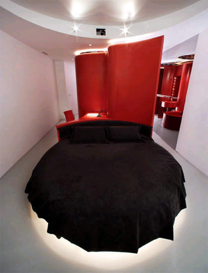
The curvaceous theme continues in the bedrooms: a curved Corian wall in red or white separates the different areas of the room, there is a round Cappellini bed, and the LG HI-MACS fixed to the wall forms an undulating headboard. A Bond-like TV that folds down from the ceiling completes the off-the-wall design.
Scottish architect Kathryn Findlay also makes play with organic shapes; in the lobby, a bench seems to grow out of the floor and the stretch canvas ceiling curves out towards the guest. Here, the emphasis is on interactivity: a ‘memory wall’ in the lobby effectively ‘memorises’ guests’ movements by repeating a distorted image moments later.
Inspired by Japanese love hotels, the rooms are definitely the most ‘feminine’ in the hotel, with an apparent lack of architectural structure, save for a translucent glass door to the toilet.
COLOURS AND TEXTURES
Richard Gluckman’s approach to materials on the ninth floor is more industrial, with extensive use of aluminium, plastic, glass and cement fibre. In the bedrooms, the idea was to create several boxes within a box; the bathroom is a huge glass box, another houses the television, the telephone box serves as the writing desk, and so on.
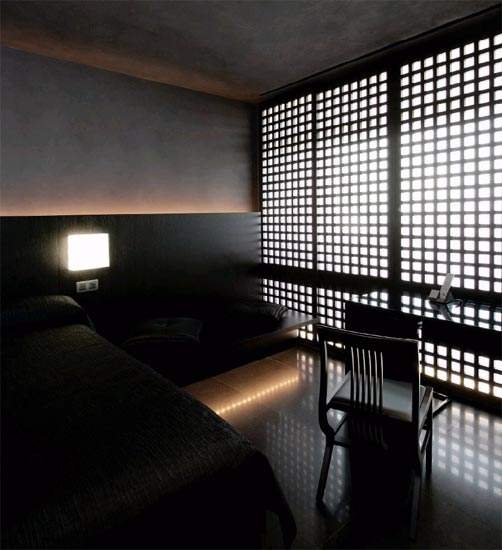
Arata Isozaki on the floor above takes his cues from the discreet elegance of traditional Japanese interiors. Although oak panelling covers one wall and the headboard, the rooms remain spacious and well lit. In the bathrooms, a lighter hinoki wood complements the marble flooring.
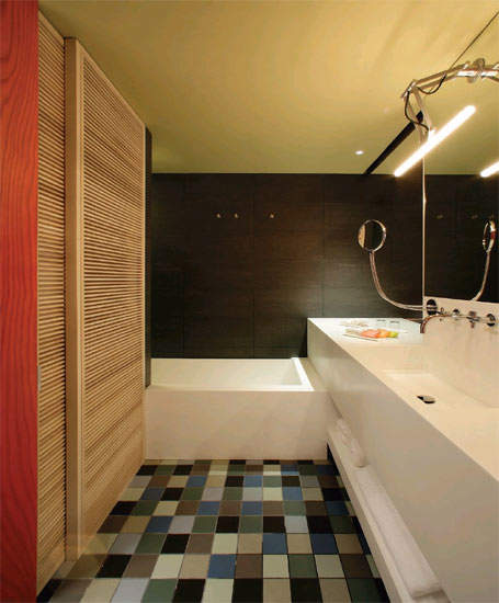
Javier Mariscal and Fernando Salas have designed the eleventh floor with absolute comfort and ‘good vibrations’ in mind. The design, incorporating many different colours, almost seems like sensory overload: orange carpet, zebra-stripe formica walls, multicoloured ceramic floor tiles and large-scale flower prints. Mariscal made a conscious decision to eschew the fiercely avant-garde look of other areas of the hotel: ‘I have tried not to [make it] an exercise in style or futurism. I have tried to achieve an anonymous character… so that it will age well.’
On the floor devoted to penthouse suites, Jean Nouvel has created rooms containing a series of sliding glass panels, so that the guest can configure the space to their requirements. Each room features photographs by Araki and Fleischer inspired by nature and the human body. Nouvel is also responsible for the terrace, bar and swimming pool.
Some observers have joked that working with one architect is hard enough; working with 19 is sheer madness. But judging by the end result at the Puerta America, Silken Hotels’ faith has been handsomely rewarded.

