The architectural challenge of this project was to combine the insertion of four art house cinema volumes into existing basement voids with the creation of an informal circulation 'route' providing a dramatic experience for the public. The conceptual approach originated from the desire to express the individual cinema forms creating an increased tension between surface and void.
Light House cinema site
The site consisted of two large-scale voids existing within the basement car park beneath the large mixed-use development.
The contrast between the insertions and the existing enclosure is achieved through the expression and separation of form and material.
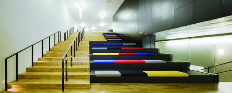
The material palette employed is matt black aluminium panels (insertions) and rendered walls (existing) while the contrast between is tempered by the American White Oak circulation route.
The voids between insertions and existing are employed to create a spatial sequence along the route, from entrance; to cafe-bar; to terrace; to concession; to gallery; to concession; to cinema screen; all of which enhance the base architectural concept.
Externally the screens are clad in a bespoke aluminium cladding system developed in tandem with the subcontractor. Each cassette panel comprises a male and female joint ensuring that all fixings are concealed.
Cinema screens
A variation of screen sizes was required to enable a diverse cinematic programme and to allow for the retention of more popular films for a longer period. It was also imperative that the route concluded with a tangible destination and also provided a counter point to the rigor of the public areas. The surfaces of walls, floors and seats achieve this with a dedicated theme for all four screens.
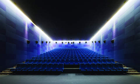
Screen one attains the optimal screening room proportions, in order to reflect this we muted the colour palette to minimise visual distraction employing various tones of blue on walls, seats and floors.
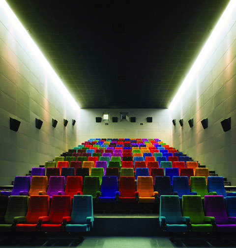
Screen two has a greater depth to width ratio, creating a more elongated perspective within the screening room. To attract focus onto the screen we muted the wall colour to a single grey tone and created a sense of drama and interest with the multi-coloured seating bank.
Screen three is suspended between the cafe-bar on ground floor and the concession / gallery space on level 3. The emphasis was kept on the element of suspension by using a single red colour on all surfaces.
Screen four is the smallest cinema screen and is compromised in section due to the terracing over. In order to overcome this we produced a spectrum of colour that runs across the walls which is in contrast with the black seating and flooring.


