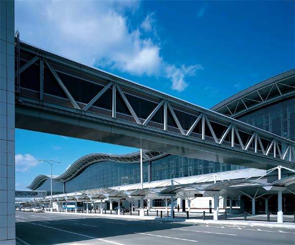
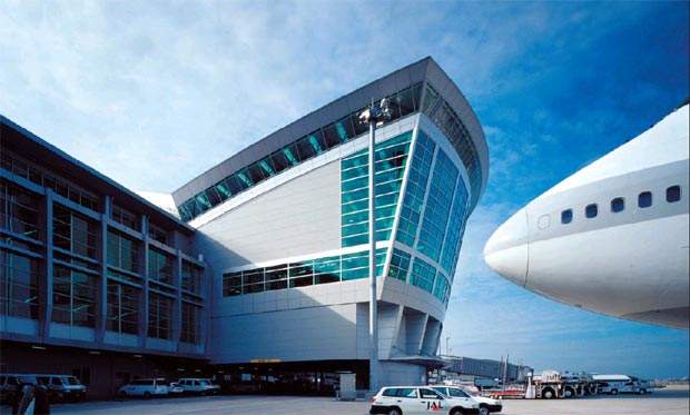
The US$280m international passenger terminal at Japan’s Kitakyushu Airport will be a new ‘gateway to Asia’. It will place the city of Kitakyushu, previously only known as a major industrial centre, on the international map.
International airports offer wonderful design opportunities. They aspire to a symbolic power that connects them to the local culture and establishes them as gateways to the world. They also function much like self-contained cities; designers have to work out the complex logistics and movement patterns for people, aircraft, vehicles and baggage.
The Kitakyushu Airport Passenger Terminal, designed by HOK with Japanese design partner Azusa Sekkei Co Ltd, was more challenging; it was being built on a manmade island in the Sea of Suou and is designed to be easily expandable.
The first phase included a total terminal floor area of 13,500m² and accommodates 1.5 million passengers every year. A future phase will add 5,000m² of terminal space while nearly doubling annual passenger capacity.
KITAKYUSHU’S RENAISSANCE
Kitakyushu is a heavily industrialised trading city in southern Japan with a population of about one million. Its strategic position at the exact midpoint between Tokyo and Shanghai (and between Osaka and Seoul) has made it a key Asian trading port for thousands of years. Yet the city’s current airport supports only small jets on domestic flights.
The city’s Renaissance Plan is a blueprint for transforming Kitakyushu from an ageing industrial city into an international centre of technological expertise. The city looked to regain its rightful position as a major transportation hub by adding a dynamic new international airport and modernising its ports.
The airport enables the city to respond to the rapidly rising demand for international air transportation in the Asia/Oceania region.
Kitakyushu Airport is located near existing cargo and passenger shipping centres and on the freeway system that runs across Kyushu. To promote trade, the Japanese Government has designated Kitakyushu as a Foreign Access Zone (FAZ).
The convenient access offered by the new airport allows the city to develop into a major international distribution centre. With a 2,500m-long runway and operations around the clock, Kitakyushu Airport gives the city a truly world-class airport.
CONSISTENCY OF DESIGN
Kitakyushu Air Terminal Co Ltd selected HOK and Azusa Sekkei to design the new airport from a strong field of prominent international firms. While all architectural plans evolve to a greater or lesser extent during the design process, the final design was very similar to the original version that was submitted.
One aspect of working in Japan that architects often find refreshing is that once a conceptual direction has been determined the entire team – architects, government officials, owners and other consultants – applies it consistently throughout the design process. The team forms an attachment to this visual concept, and it becomes integral to the ‘story’ of the building.
HOK has experienced the same thing in its other Japanese projects. At Sendai International Airport, for example, initial findings called for curved roofs reminiscent of the local rolling mountain range and undulating sea edge.
HOK also teamed up with Azusa Sekkei on the designs for the International Passenger and Cargo Terminal at Fukuoka International Airport and the Nagoya Airport International Passenger Terminal.
The latter project involved Nikken Sekkei, which also worked with HOK on the design of the terminal building at Sendai International Airport. In these partnerships, HOK typically assumes the role of design architect, and occasionally provides airport planners, while the Japanese partners provide planners, architects and engineers.
For the Central Japan International Airport Passenger Terminal Building in Tokoname, a coastal suburb of Nagoya, HOK started with the idea of folded paper planes. In each case, the ideas were followed through and became project hallmarks.
RECLAIMING THE LAND
Open, flat land that is suitable for new airports is at a premium in Japan. The new airport was therefore built on an artificial island in the Sea of Suou, 3km offshore and 15km from downtown Kitakyushu. The island is 4.125km long and 0.9km wide, and the temperate climate, consistent winds, favourable topography and geographic conditions are all perfect for an airport.
Kitakyushu has built an international sea-lane as part of its port improvements, and the island was built with sludge from the dredging operation. Combining the two projects reduced the construction costs and also made sense from an environmental point of view.
The fact that the island is connected to the mainland by a bridge has had a major influence on the building’s structure and materials. The team carefully sized the building modules so that the construction company could fabricate and transport them across the bridge without too much trouble.
Building on a reclaimed island site also meant that the team had to minimise the facility’s overall weight and select materials for the exterior glazing and roof systems that would endure in the harsh saltwater environment.
Placing the airport 3km offshore greatly reduces the effect of aircraft noise on the mainland’s residential areas. This means the airport can operate around the clock. Also, because the water surrounding the island is only 7m deep, future expansion on more reclaimed land will be a relatively simple and inexpensive procedure.
FUNCTIONAL BUT FUTURISTIC
The main terminal is designed to be functionally simple and architecturally elegant. An airport passenger terminal must perform well both inside and outside the building while creating the appropriate architectural image. The challenge is to achieve a balance between the airside configuration plan and the terminal design without compromising either.
At the Central Japan International Airport, HOK used an origami concept to create a beautifully symmetrical building plan and a futuristic, elegant skin. However, it also made sure that the plan satisfied all apron efficiency and passenger movement requirements.
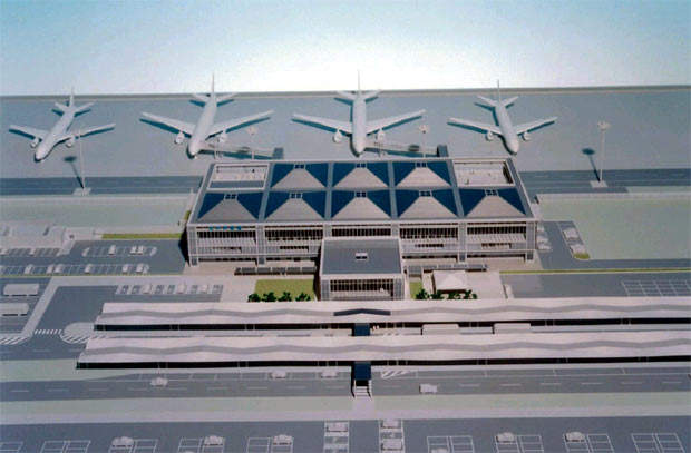
The apron plan at Kitakyushu is flexible because there were not many restrictions on planning the airside on the island site. This meant the team was able to spend more time on the terminal building. The design aligns the main aircraft stand’s parking axis with the building’s centre axis, providing dynamic airside views of the aircraft.
The apron plan is very straightforward, clearly distributing space between restricted and non-restricted areas. Maximising the usable interior space while minimising exterior surfaces also helps to reduce the total building costs.
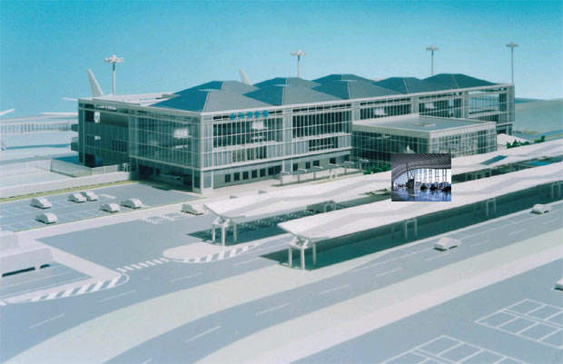
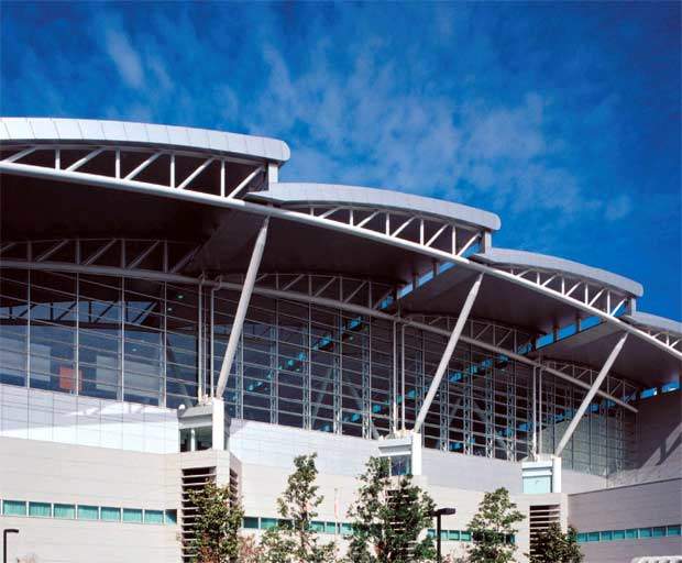
A modular roof creates an open, airy atmosphere filled with natural light. The main roof element is inspired by the ‘lantern’ parade floats seen at the local Gion Festival and by the beautiful mountain peaks on the horizon.
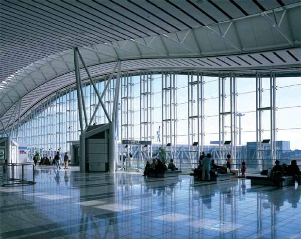
The roof appears to float above its distinct structure and large glazed facade. The water and mountain backdrop creates a dramatic building image during the day, while at night the well-lit modular roof is no less spectacular.
EXPANDING THE CONCEPT
The ultimate goal is for the airport to double in size, so the passenger terminal building must be expandable. The modular roof structure fits together in 24m-long units, making it easy to build, and eventually expand, the sequence of roofs.
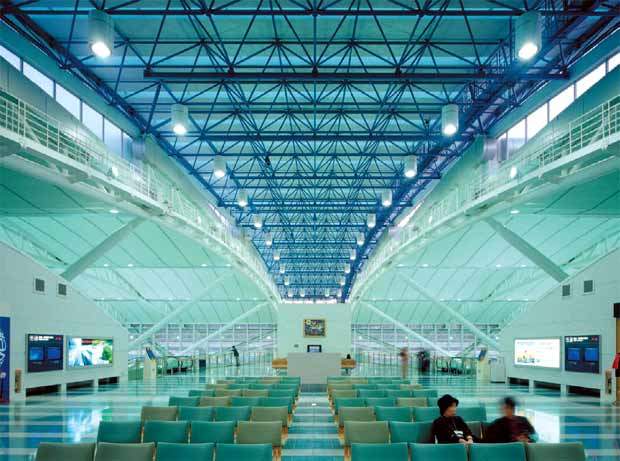
The main terminal has an easily expandable tartan grid framework supporting the pyramid shaped roof lanterns. This clear grid framework recalls the simple, sturdy framing of both traditional and contemporary Japanese architecture. Four post columns integrate the mechanical air distribution system with the structural concept.
The grid organises the terminal’s large open spaces into clear zones of light, creating a layer of intermediate scale and a clear hierarchy of spaces. The nature and geometry of the grid, combined with the way it layers materials and light, recalls the richness and texture of Japanese designs: sometimes subtle and refined, other times bold and vibrant.
CLIP-ON OPTIONS
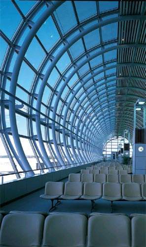
Along the eastern airside and western landside of the main terminal are secondary elements of glass and steel that appear to ‘clip onto’ the steel superstructure. These elements accommodate passengers and visitors as they arrive and depart. They also moderate the low-angled rising and setting sun, as well as offering views into the terminal and out onto the runway.
On the airside, the clip-on piece is the linear zone containing the boarding gates. A glass edge facing the aircraft provides a critical visual connection that makes orientation easy for passengers. The landside module is an entry pavilion that eases the vertical transition between the arrival and departure levels and the drop-off zone. The pavilion will function as both a grand arrival hall and an exhibition space.
SUSTAINABLE FEATURES
The design of the passenger terminal incorporates several eco-friendly features to help Kitakyushu improve its environmental image while reducing operating costs.
Much like the US rust-belt cities, the Kitakyushu industrial zone has experienced serious pollution problems while supporting Japan’s fast-growing economy. Over the past three decades, tremendous strides have been made in cleaning up air quality, Dokai Bay and the city itself. In the process, city officials have accumulated a wealth of expertise in resolving environmental issues.
Another key component of the Renaissance Plan is to make Kitakyushu a genuine ‘eco-town’. The design supports Kitakyushu’s commitment to a sustainable approach in several ways:
- Because the reclamation was built with the port dredge soil, the entire island is, in effect, recycled
- The terminal’s building envelope is designed to use natural daylight and to mitigate heat gain from early morning and afternoon sun
- Energy efficiency is emphasised through use of high-performance glazing, including tinting, ceramic frit patterns and low-e coatings
- Building materials and finishes favour renewable, locally sourced materials, such as recycled carpet tiles and recyclable wallpaper
This simple design ensures a cost-effective, flexible and environmentally aware terminal. The modular structural design may be relatively straightforward, but the elegant skin and unique location make this a rich and unique building.

