The Hotel Puerta de America is a luxury hotel development concept in Madrid, Spain. The hotel was built by Hoteles Silken (a joint venture of Escampa and Hotel Group Urvasco SA) and required an investment of €75 million. It opened in July 2005.
The 14-storey hotel has an area of 34,000m² across 12 floors and has a total of 342 bedrooms (308 premium rooms, 22 junior suites and 12 suites on the top floor). The 179ft (54.69m) hotel is unique in that 18 top architects and interior designers were chosen to be involved in the design and construction of different aspects. The hotel has been designed to appeal to a wide variety of cultures and nationalities and is the very antithesis of hotel rooms all looking the same.
The hotel was opened at a time where it could lend weight to Madrid’s bid for the 2012 Olympics; although this has now gone by the wayside, the city now has a first class, five star hotel. The construction of the hotel required 650 personnel. The hotel general facilities include: an underground car park, a relaxing landscaped garden, an indoor swimming pool, a sauna and spa, a business centre, bar-cafe-restaurant, airport shuttle, convention centre and WiFi.
Hotel Puerta de America architects
Each architect / designer was responsible for a particular aspect, floor (1,200m²) or facility of the hotel.
Designers
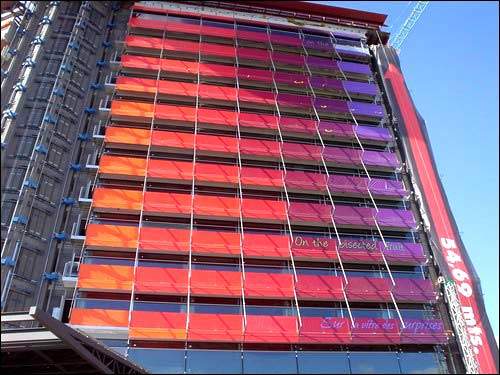
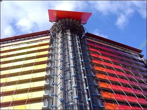
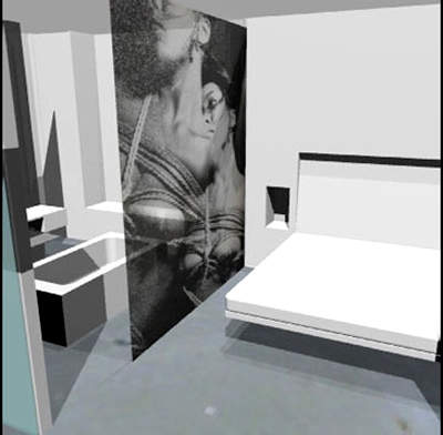
Jean Nouvel: The French architect was commissioned to design the façade, the penthouse and the 12th floor, which boasts 12 suites. In the latter space he blended photography (lining the walls with images of women and flowers) and architecture to achieve a highly provocative space ideal for “experiencing exceptional moments”. The façade is polychromatic, running through shades of yellow and red to indigo and violet.
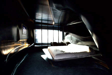
Zaha Hadid: The first woman to win a Pritzker Prize (termed “the Nobel of architecture”) designed the first floor. The rooms almost seem to be liquid rather than space, where the choice of innovative materials is yet another outstanding feature.
Norman Foster: The UK architect has created a serene environment on the second floor, which harbours the guest from the hustle-bustle outside. Leather is the pre-eminent material through which different acoustic and tactile sensations are sought. He prefers light and simple lines without excess clutter; the design is futuristic, flexible and sinuous.
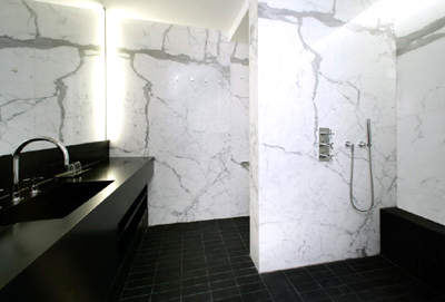
David Chipperfield: The third floor proposes a simple yet luxurious space where Chipperfield combined handcrafted finishes, upholstered panels and white marble. Chipperfield creates a sensation of depth and surprise by paying careful attention to colours and lighting both in the lobby and hallways and in the rooms. He uses materials such as terracotta and marble to achieve a feeling of luxury, depth and privacy for the guest.
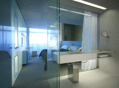
Eva Castro and Holger (Kehne Plasma Studio): The fourth floor’s highly geometrical design could well come straight out of a science fiction novel. The baths and the dividing walls between the bedrooms and en-suites facilities are made of glass.
Victorio and Lucchino: The design team from Seville used different types of warm fabrics, such as linen, and decorated the walls of the rooms with different motifs, achieving a truly welcoming, warm space where the guest feels virtually embraced by the fabrics and colours. The floor is paved in distressed black stone. Colours such as Bordeaux, anthracite, chocolate brown, black and beige are the main theme.
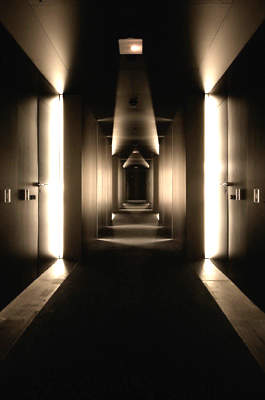
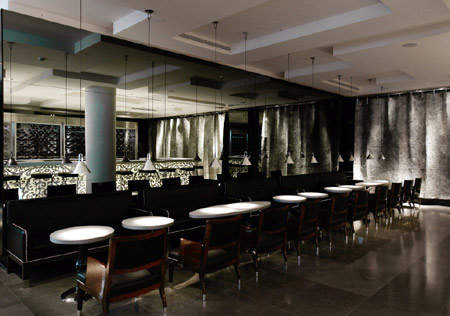
Mark Newson: The Australian architect created two extremely modern, relaxing and sophisticated spaces on the sixth floor and the bar, featuring an interplay of just a few materials. The hallway of the sixth floor is created totally from red lacquered wood, resembling a mirror and the bathrooms feature Statuario Venato Marble from the Carrara quarries. In the bar, he creates spaciousness in a work boasting a marble bar, a single piece weighing more than 6t and measuring 8.25m long, and 400 strips of laser-cut aluminium.
Ron Arad: The space on the seventh floor has been organised in a highly provocative, imaginative way. The floor space, rather than the walls, creates an internal pathway that gradually reveals each of the spaces within the rooms.
Kathryn Findlay and Jason Bruges: Kathryn’s intention was to create a meditative space on the eighth floor where guests can dream or, as she claims, listen to the wind. The architect barely separates the spaces using white curtains in order to achieve a highly feminine space. On the same floor, Jason, an interactive designer, worked in conjunction with Kathryn to create light fibre optic panel installations for the lobby and hallway (memory wall) that react to guests’ movements.
Richard Gluckman: The ninth floor uses materials such as methacrylate in unexpected and surprising ways. The concept is that of “a box within a box”. In this way, the space stands out for its orderliness and feeling of lightness and neatness.
Arata Isozaki: The Japanese architect provides guests with a subtle, relaxing interior design on the tenth floor, with a clear Japanese influence. The bathroom harks back to typically Japanese traditions, with the wooden bathtub and shower placed together. Also noteworthy is the shoji, a panel reminiscent of the Far Eastern country’s traditional homes.
Javier Mariscal and Fernando Salas: The eleventh floor uses graphic design to provoke different sensations. A broad palette of colours, especially in the rooms’ floors and walls, attempts to convey liveliness and imagination.
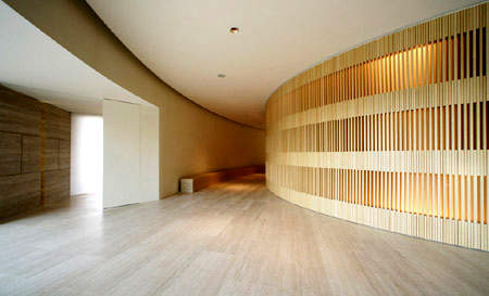
John Pawson: The lobby and meeting rooms (150m²) are "a space to encounter peace and quiet in the heart of the hotel". This is achieved through the use of wood and a design that harbours the reception area in a semi-circle, thus sheltering the guests from the constant motion passing through the area.
Christian Liaigre: Different aspects of Spanish culture are combined in the restaurant, called Lagrimas Negras (Black Tears), with a leather and wood interior that provides a home for high-quality cuisine. The wine cellar is a structure (sculpture) of aluminium and glass which separates the kitchen from the dining room and can hold over 4,000 bottles, all in plain view.
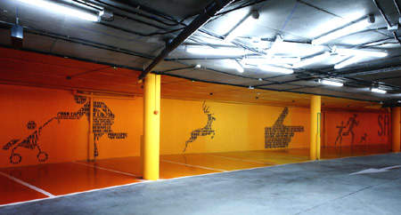
Teresa Sapey: The Italian architect designed the underground car park using a simple combination of line and colour. In this way, each floor presents an interplay of colours, most notably warm tones in the first underground level. A simple iconographic code on the walls based on a poem by Paul Eluard (Freedom) leads guests through the car park.
Harriet Bourne and Jonathan Bell (B+B UK): These well known designers handled the landscape design in the outside garden. The vegetation is designed to reflect the changing season while complimenting the building it surrounds. Indeed, in their opinion, "the integration between vegetation and buildings is fundamental". They have created an oasis in an urban environment.
Arnold Chan (Isometrix Lighting and Design): Was commissioned to design and co-ordinate the building’s lighting scheme, adapted to and supporting the designs of each architect.
Oscar Neimeyer: The Brazilian architect has exclusively designed a sculpture to be placed in the adjacent park. It takes the form of a sickle-shaped work that harks back to the poetic shapes of his best buildings.
Felipe Sáez de Gordoa (SGA Estudio): Developed the design for the structure. With extensive previous hotel build experience, he laid the foundations for the space upon which the other architects and designers have worked.
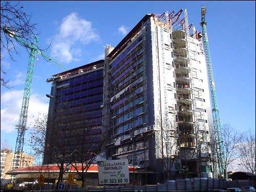
The hotel has two entrances. The main entrance is a raised orange pathway with entrance for vehicles right up to the main doors. It is slightly lower than the street level on the Avenida de América side of the building; this enables guests to arrive directly to the entrance, where the reception area and the common usage areas such as the restaurant and bar are located. The back or service access is located on Corazón de María street. The hotel structure has a characteristic dihedral laminar shape (150°) of 12 floors, with two adjoining cylindrical bodies on the ground floor.
Contractors
The construction company for the hotel was Ferrovial Agroman SA. The crane supplier and scaffolding supplier was Jaso SL. Jaso SL also supplied the elevators. PERI SA was responsible for formwork and scaffolding. The wind surveyor for the building was Instituto Universitato de Microgravedad (Ignacio da Riva).

