Annes Gate Property, as developer of the Home Office Headquarters project, represented the consortium behind the PFI. This consiortium comprised many top companies involved in aspects as diverse as contractors for design and build, operations and equity providers. The discounted whole life project value was £311m at financial close.
LOCATION / SITE CHARACTERISTICS
The architect has a long involvement with the former Department of the Environment site, previously occupied by the Marsham Street Towers, built between 1963-71.
The consensus was that they were inappropriate as a backdrop to a world heritage site adjacent to the Palace of Westminster, ‘the very image of faceless bureaucracy’ (Buildings of England).
THE PROPOSAL
Throughout the 1990s the architects produced masterplans advocating reinstating the area’s historic pattern to replace the overscaled, impregnable podium and towers by erecting separate buildings and re-making lost street frontages and public spaces.
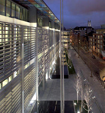
In 2000, the architect’s contribution to the winning PFI bid, launched by the Home Office, demonstrated the feasibility of a low-rise mixed-use scheme. The delivered scheme provides a similar overall gross floor area to the previous structure, of 1million square feet, with approximately 800,000ft², of office space sufficient for 3,500 Home Office staff in three inter-connected low-rise buildings. The remaining space consists three residential blocks, providing 140 private and affordable apartments, nine shops and three kiosks.
The senior architect commented, ‘The site should be treated as an urban quarter, with all the diversity of uses, mixture of architectural treatment and range of building sizes that characterise the best parts of central London.’
FEATURES OF THE SCHEME
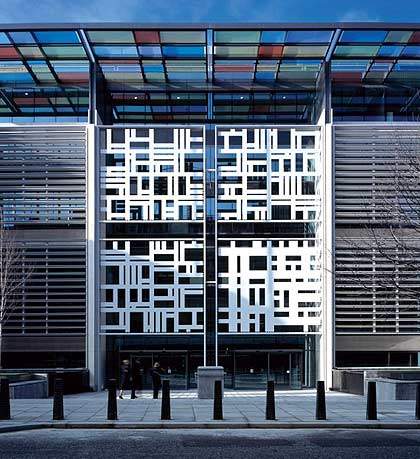
- A glazed, street-fronting building with a welcoming public face
- Centrepiece of arts strategy: an iconic screen above the main entrance
- Three office blocks each arranged around a central atrium (two of seven storeys above ground level, one of five storeys)
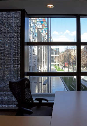
- 95% of occupants sit within 6.5m of a window or naturally lit atrium
- Primary naturally lit internal ‘street’, with shared facilities: cafés, meeting points, reprographic / mail areas connect all three buildings
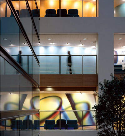
- Integration of core activities in a vibrant setting aids good working practices
- Framework of interior colours is augmented by super-scale graphics
CONSTRUCTION SYSTEMS / SPECIFIC MATERIALS
The substructure design re-uses existing basement rafts and the walls that remained following demolition of the tower blocks. The hybrid frames comprise a high proportion of precast concrete, stitched together with in-situ concrete columns, walls and slab topping, allowing high standard construction. Anstrude limestone panels act as a rainscreen; the curtain wall drains down the back of the stone to minimise staining.
IMPACT
The building is efficient without sacrificing aesthetics. Collaboration between the architect and artist Liam Gillick introduces generous use of colour on the lightweight glass canopy, giving the complex exterior visual interest along the elevations.
Coloured glass vitrines enliven the office space, creating a positive impact for the area and privacy for personnel. Artworks by contemporary artists in the buildings and environs distinguish the Home Office.
The scheme provides a flexible, cost-effective, state-of-the-art headquarters and fosters a new community orientated district. Cross streets have been created between the blocks giving permeability and introducing pocket parks.


