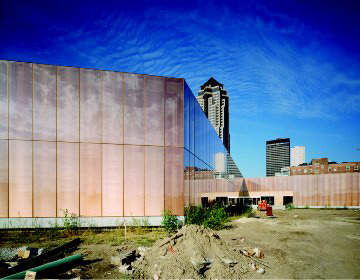
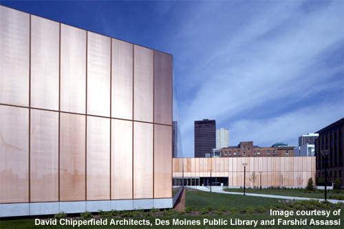
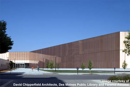
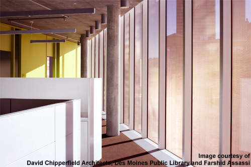
In downtown Des Moines, Iowa, the central branch of the Des Moines Public Library appears windowless but turns out to have a plethora of full-height glazed surfaces. Triple glazing with an integrated copper mesh enables this optical illusion to occur. During the day, the façade seems opaque and glows with a warm, coppery colour. At night, when interior lights are on, the façade becomes transparent.
London-based David Chipperfield Architects, a Stirling Prize winner in 2007, designed this two-storey library for a city of nearly 200,000 and for a five-county metropolitan area with over half a million people.
The city is flat and gridlike, and people are accustomed to traditional brick-and-mortar fare.
Though Des Moines features several buildings by distinguished architects, including Eliel and Eero Saarinen, Mies Van der Rohe, IM Pei and Richard Meier, Chipperfield’s contribution to Des Moines stands out as a shimmery work of minimalism to which locals have had a mixed reaction. The library opened in April 2006.
THE INTENDED CONTEXT
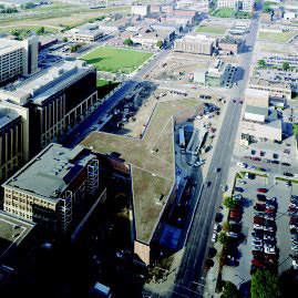
From above, the library resembles an airplane, the shadow cast by a misshapen bird or even a half-peeled banana. The wings of the building meet each other at broad angles.
The idea behind this shape was for the building to embrace its green surroundings and to create sheltered areas or ‘pocket parks’ between the wings.
The library sits at the heart of the new three-block-long Des Moines Western Gateway Park, an area scheduled for intensive brownfield regeneration and urban renewal efforts. The library and park were meant to be a centrepiece for these efforts, which would ideally entice people to move back to the city centre.
The plan also called for dense planting in the park, and Chipperfield had that lush plant life in mind when he designed the building. According to his firm, the library is transparent so people on the interior can feel that they’re reading a book in a park.
But the landscaping remains far from lush, so the copper façade mainly reflects other buildings, not trees (though one architecture critic still finds the overlapping reflections dazzling). Moreover, rather than feeling that they’re in a tranquil oasis, people in the library currently gaze out on other structures and may be aware of passing traffic on nearby busy streets.
TRIPLE-GLAZED SKIN
Creating a transparent skin for this concrete building involved several challenges. As a prairie state, Iowa experiences frigid winters and sweltering summers, so the library needed to be well insulated while allowing little solar gain.
Okatech, a material from German manufacturer Okalux, provided the answer. Okatech is a triple-glazed unit with a metal mesh screen integrated between the outer two sheets of glass. Architect Rem Koolhaas used Okatech on his Seattle library, but in that case the metal mesh was aluminium. From the interiors of buildings with Okatech windows, the metal mesh seems nearly invisible.
In the Des Moines project, the glass panes are 4.2m tall. The outermost sheet of glass is 8mm thick and low-iron. Next to that lies a 2mm cavity containing the expanded copper mesh, which has been fixed in place with silicone (then concealed with delicate copper-coloured fritting) so as not to bounce around inside the glazing unit when traffic shakes the building. The next glass sheet is again 8mm thick, and this piece of glass has a low-e coating. Then comes another 16mm cavity. Finally, two 5mm laminated glass sheets form the innermost glazing unit. The glazing units had to be sealed well to keep out air, which could oxidise the copper.
The Okatech reduces solar gain by 80%, filters out 87% of UV light (protecting library materials) and cuts down on glare while illuminating the depth of the space. Overall, this window unit cuts long-term energy costs significantly by minimising the need for air conditioning and artificial lighting. The Okatech is so effective at sun shading that the library needs no other devices for that and can maintain its transparency.
Just 60% of the library’s façade actually has Okatech units, but it’s difficult to tell that from the outside. The remaining units occur in administrative parts of the library and are not transparent but rather are backed with insulation and aluminium fascia.
GREEN FEATURES
The library has received an excellent energy rating from the local energy supplier and therefore earns a significant cost rebate on top of savings on the energy bill.
Okatech is not the only feature that promotes sustainability. A green roof helps to retain rainwater, thus minimising the impact of rain on the sewer system.
The roof supports a robust layer of sedum, a self-seeding flowering plant that requires no maintenance or irrigation. Under the soil, a layer of fabric prevents roots from growing down into lower roof layers. These include (from top to bottom) a layer for water storage, aeration and drainage; a layer of polystyrene insulation; a layer of protection from water damage, UV light, root growth and chemicals used on vegetation; and finally the concrete roof.
From certain perspectives (e.g., nearby high-rises), the rooftop greenery blends in with the grass and trees of the in-progress park. The green roof also increases the building’s mass, which means that the roof absorbs and stores heat during the day, radiating it back out at night. This significantly reduces the need for air conditioning on hot days and heating on cool nights.
DES MOINES FEATURES OF NOTE
Two aspects of the interior grab one’s attention. The two staircases are freestanding, and the blackness of their steel contrasts vividly with the green of the partition walls – a green that one architecture writer has compared to the flesh of a kiwi fruit.
The library has multiple entrances, but two are significant. Positioned across from each other at the place where a wing joins the main building at a right angle (more or less), these opposing doorways invite people to cut through the library as they walk through the park. Thus, this wide ‘gateway gallery’ has a concrete floor, rather than the carpet covering the rest of the library floors.

