In an era of rapid urbanisation, many of the world’s cities are sprawling outwards and developing inwards, with increasing population densities presenting challenges for planners striving for some sense of cohesion and harmony. In this regard, the importance of public spaces for city-dwellers to socialise, share culture or simply move through cannot be over-estimated.
As French architecture critic Francis Rambert wrote in a January editorial for the website of the European Prize for Urban Public Space, “public space is the place of connecting, which may be through Wi-Fi or by means of physical space. A ‘smart city’ without spatial quality couldn’t be welcoming and it couldn’t be sustainable.”
So what is at the current cutting edge of design when it comes to the public buildings that facilitate these vital connections? Looking through some of 2016’s most high-profile cultural and social building projects – from a new transport hub on the site of the 9/11 attacks to the newest and likely final museum on Washington DC’s National Mall – provides insight into the latest design trends for cities; all-important public spaces.
National Museum of African American History & Culture, Washington DC

The task of designing the $540m National Museum of African American History & Culture, the US’s first federally-owned museum of African American history that was finally authorised in 2003 after decades of campaigning, was never going to be an easy one. For David Adjaye, the Ghanaian-British architect who led the Freelon Adjaye Bond/Smith Group team that designed the museum, the process of seeing through his vision for the project – a three-tiered temple-like structure clad in bronze-coated latticed panels – from conception to completion was at times painful.
“There were so many attacks on our design that it felt like a bloodbath at times,” Adjaye told GQ magazine in August. “But we ended up with a building that's got 90% of what we wanted, which for architecture is pretty damn great.”

US Tariffs are shifting - will you react or anticipate?
Don’t let policy changes catch you off guard. Stay proactive with real-time data and expert analysis.
By GlobalDataThe end result was opened to the public on 24 September, and tickets to visit the museum have already sold out until spring 2017. Adjaye’s design, whose outer façade shines from deep brown to brilliant gold depending on the prevailing weather and time of day, builds in subtle references to the history of black America, from the intricate patterns on the cladding that hark back to the ironworking skills of freed slaves to a free-standing entrance shading structure that is meant to evoke the front porches of Southern houses.
The building also makes use of significant below-ground space to pack in as much space as possible to display the museum’s 37,000-strong collection. With initial visitor dwell times reaching up to six hours – far longer than the average museum dwell time of around two hours – the structure has won praise for adroitly fulfilling its dual role as a repository of the African American experience and as a cohesive final piece of the puzzle for Washington’s historic National Mall.
Harbin Opera House, Harbin

The star of Beijing-based design firm MAD Architects has risen quickly since its establishment in 2004, with lauded projects completed across China, and a growing list of work in Europe and North America. Perhaps the crown jewel in the company’s portfolio is Harbin Opera House, which opened in December last year in the city of Harbin, northern China, to great fanfare. The building, whose Zaha Hadid-esque sweeping curves were designed to echo the “force and spirit of the northern city’s untamed wilderness and frigid climate”, is a fitting tribute to Harbin’s national reputation China’s ‘Music City’.
Harbin Opera House combines a monolithic, mountainous exterior with a warm, wooden exterior inside the grand theatre, its Manchurian ash walls curving cavernously while maintaining world-class acoustics. A subtle skylight provides the audience with an unusual connection to the outside world; a choice that is echoed in the opera house’s smaller second smaller theatre and its panoramic glass backdrop.
The opera house, which in February won ArchDaily’s Building of the Year 2016 award in the cultural architecture category, may be the clearest reflection yet of MAD founder Ma Yansong’s ‘Shanshui City’ philosophy of blending the built environment with nature. “I didn’t want the building to feel isolated from the environment,” Yansong said in an interview with the New York Times in April. “The site is a major wetland. People come there to enjoy nature. So I designed the façade so that you can walk onto the building via a ramp and reach the rooftop where you can look at the overall landscape. You don’t have to have opera tickets to interact with the building.”
World Trade Center Transportation Hub, New York

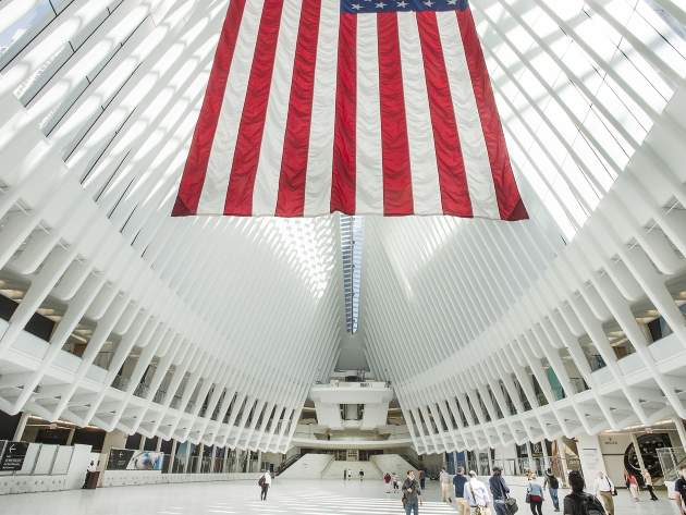
Spanish architect Santiago Calatrava’s design for the World Trade Center (WTC) Transportation Hub has had a rocky road to completion. The transit hub opened at ground zero of the 9/11 terrorist attacks in March this year, after enduring 10 years of delays and its budget ballooning to nearly $4bn. The hub has attracted strong criticism for its protracted development and construction process, some of which was focussed on Calatrava himself for architectural decisions that drove up the cost and complexity of the project while seemingly emphasising form over function.
The mixed response to the finished product may be partly explained by observers’ understandable inability to separate the structure from its cost. The station’s winged form has won plaudits for its striking aesthetic, sociable piazza space and the powerful impression it makes from the inside, with views illuminated by a 330ft skylight that runs along the building’s curved roof.
Nonetheless, the building has been criticised for its finished form – which the likes of LA Times architecture critic Christopher Hawthorne have criticised as compromised and “overwrought” – as well as its overblown expense, to the extent that developers of large-scale urban infrastructure could study it as a warning as much as an example. Still, the value of public spaces has always developed over decades, and it’s yet to be seen whether future New Yorkers will end up seeing the WTC Transportation Hub as a white elephant or a city-wide treasure.
Tate Modern Switch House, London

It’s been more than 15 years since Swiss architecture firm Herzog & de Meuron designed the original conversion of London’s Bankside Power Station into the Tate Modern, which would go on to become the world’s most visited museum of modern and contemporary art. It’s fitting, then, that the company was chosen to design the Switch House, a massive expansion of the gallery that has seen a new, angular 64.5m tower jut out from the Turbine Hall, with the main exhibitions connected to the new extension via two indoor bridges. The expansion project, opened to the public in June, has increased the Tate Modern’s exhibition space by 60% and prompted a record 54,000 visits the day after its launch.
The tower’s red brick exterior, which is twisted into geometric shapes that alter the tower’s appearance from different angles, is designed to incorporate seamlessly into the original Turbine Hall; the architects favouring harmony between the old and new over creating a new statement that would inevitably inflame controversy. In dense metropolitan areas that already represent an assault on the senses, sometimes it’s better to blend in than stick out.
“An addition to an existing building is always very difficult, even problematic: some people will like the new part better, others will prefer the old part, some may say the extension was not necessary, others are convinced of the opposite,” said Herzog & de Meuron co-founder Jacques Herzog after the opening of the Switch House. "We wanted to anticipate such controversial views. Our aim was to create a building conglomerate which appears as one thing, not as a phase one and a phase two."
Taipei Performing Arts Center, Taipei

As cultural public spaces, theatres have traditionally been fairly conservative in design. After all, the needs of theatrical performances do tend to favour fairly boxy spaces that prioritise seating capacity and clear views of the stage. With his approach to the new Taipei Performing Arts Center (TPAC), currently nearing the end of construction and set to open to the public in June 2017, Rem Koolhaas and his design studio OMA seem determined to shake up the orthodoxy to reflect the changing ways in which the public views theatre.
“Why have the most exciting theatrical events of the past 100 years taken place outside the spaces formally designed for them?” asks the design studio in a statement on its website. “In recent years, the world has seen a proliferation of performance centres that, according to a mysterious consensus, consist of more or less an identical combination: a 2,000-seat auditorium, a 1,500-seat theatre and a black box. Overtly iconic external forms disguise conservative internal workings based on 19th century practice.”
TPAC is a bold reaction to the mores of traditional theatre design. The centre incorporates three theatre spaces, which all adjoin a transparent central cube, where backstage and technical facilities are shared by all three. The 800-seat Proscenium Playhouse auditorium takes the form of a massive sphere that is conjoined to the central core of the building, bearing a surreal resemblance to a crashed asteroid or a bubble that’s about to float away from the structure.
A public walkway runs through the building, exposing the production and technical spaces – the inner machinery of the theatre – to passers-by, in an attempt to draw a wider swath of the Taiwanese capital into TPAC’s world. The centre’s vivid exterior design has inspired its share of controversy, with many local observers criticising its jarring interaction with its surroundings. Visual concerns notwithstanding, OMA’s audacious attempt to crack open the theatre could help redefine performance centres as connected public spaces.


