Steckelhörn 11 was commissioned directly from the client, Cogiton Projekt Altstadt GmbH in 2007, without a competition. The design team Juergen Mayer H, who are based in Berlin, consisted of Hans Schneider, Wilko Hoffmann and Marcus Blum.
The office block is situated in the city centre in an old part of Hamburg, Germany, and was completed in October 2009, taking two years to build. It is located between the city’s main commercial areas and the Hafen City project – a
massive area of urban development, where over 50 projects are already underway.
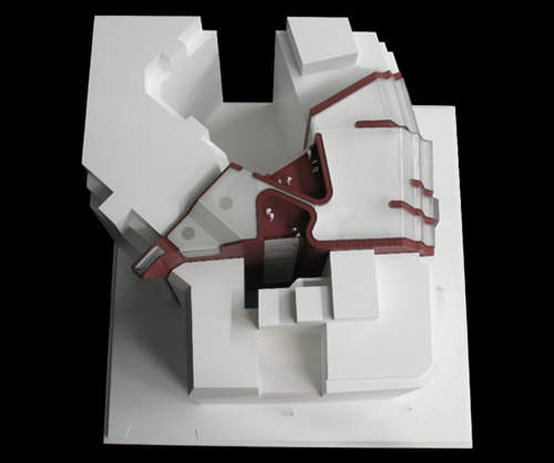
The building stands where an old warehouse which was used as a storage facility was sited, with two historic buildings on either side. While designed to be part of its environment, the building also stands as a landmark when viewed from the
Speicherstadt, a storehouse city built in 1885-88, or Hafen City, which is just a few minutes walk from the city centre.
The Steckelhörn 11 squeeze
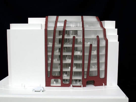
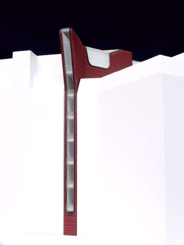
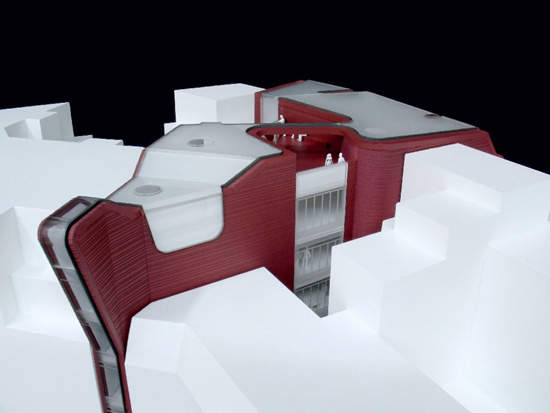
The most unusual thing about the Steckelhörn 11 office development is its shape. From the front façade made of glass and aluminium, which is about 26.4m wide, the building fits into the irregular space between neighbouring buildings, emerging on the harbour side a tiny 1.8m in width.
The main façade of the office block faces towards Steckelhörn Street. The outside appearance is constructed of glass, aluminium and ceramic, which was used as a contrast to the more traditional brick buildings in the centre of Hamburg.
It was also a more flexible material to work with within such an unusual shape than a brick structure. Concrete is used inside the building.
The outer façade was designed to harmonise with the surroundings and create a new interpretation of urban space. Cantilevered elements in the main façade create a series of specific spatial qualities on the inside and outside.
The building is squeezed into a very narrow street, but the actual design was more of a challenge than finding materials to work within the space. “It was very difficult to organise the floor plan,” says Wilko Hoffman, an architect at J Mayer H “Minimum
space was used for stairways so there was enough space for offices. We have to respect all the rules,” he adds.
Another problem was to let enough light into the building, a problem partly solved by a white interior and very large glass windows on the front facade.
Steckelhörn 11 design
The floor area is 3,600m² with a further 500m² in the basement. There are eight floors; seven of offices and one at the top for the equipment powering the building – electricity, machinery and air conditioning. To help reduce the costs
of running the air conditioning, and heating the building, there is an active core system inside the concrete ceiling. Water flows through the tubes which cool the concrete in summer and warm it in winter.
Floors seven and eight are set back by about 1m, and are shaped to match the buildings on either side. The glass flows round over the top of the building in a liquid-like curve.
The interior is envisaged as connecting together in one
design, with the ceiling, walls and floors working together.
Colour stripes provide a theme and drip like water coming down the ceramic façade. The white ceiling is intended to contrast with the dark carpet, with the stripes getting progressively brighter and brighter.
The ground level is conceived as a spacious lobby or a public café. The upper floors have views over the Katharinenkirche which is the one of the most historical of Hamburg’s five main churches, or
Hafen City.
There are also balconies on the top floors offering panoramic views of old and new Hamburg, and a green roof to add vegetation.
Münster-based Heijmans Oevermann construction company were among the contractors that worked on the scheme and different parts of the building were contracted to different companies. The architect on site was Imhotep, Donachie und Blomeyer, with structural engineers Lydia Thiesemann and WTM. Building services were provided by Energiehaus and Sineplan.

