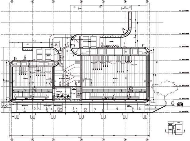
Foreign Office Architects was chosen to design the BBC’s new music centre from four shortlisted architectural practices. But in 2008, the BBC cancelled the project after deciding that future growth would see the organisation develop in other areas of London and beyond. It was intended that the project be financed and constructed through the BBC’s property partnership with Land Securities Trillium.
The music centre – which was to be called the Music Box – was scheduled to open in 2006, and would have become the home of the BBC Symphony Orchestra, the BBC Symphony Chorus, the BBC Concert Orchestra and the BBC Singers, the idea being it would bring them all together under one roof for the very first time.
BBC music centre
The design for the BBC Music Centre in London’s White City posed a difficult question: is it possible to balance functional requirements and budgetary constraints with an organisation’s need to convey its values and culture through architecture?
The aim of this proposal was to challenge the old dichotomy of form and function, and to reconcile presentation with representation. Rather than using a prefabricated architectural style, the project would have derived inspiration from its urban surroundings, the building process and the culture of the BBC itself.
Flexibilty through independence
The new BBC music centre, known as the Music Box, would have been essentially separate from the additional office complex that formed part of the initial competition brief. The additional office buildings would have to be considered as tradeable assets, especially given the future developments at the Unigate site and Chelsfield close by. This created considerable uncertainty as to what would be the best investment strategy for the BBC. Flexibility was therefore crucial to the success of the scheme.
The combination of several facilities in a single building would have been certain to create potential clashes in terms of access and schedule, with no apparent benefit other than maximising its skyline presence through sheer bulk. We believe similar effects can be achieved through design itself.
Visibilty and openness
The site is in a very central position in relation to the other BBC facilities in the White City area. The White City plan gives over the ground floor to commercial activity, which in turn will create more of an urban fabric.
One of the peculiarities of the campus is that there is no centre capable of hosting large public events, so the plan could have been complemented with a larger space for all the White City BBC facilities: a kind of BBC plaza.
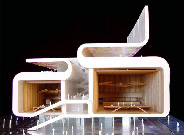
Given the structure of the surrounding fabric, it would not have seemed reasonable to turn it into a single monumental space. Breaking the mass into two volumes not only would have made more efficient use of the ground, it would also have arranged the public space into a series of interconnected plazas able to respond to the multiple facets of an urban setting.
Public space and community
Fronting onto Wood Lane, a public plaza would have allowed a view into the campus from the street and the underground station. Towards the side of the building, connected to the main street of the current master plan, a public space would have enabled large-scale events inside the campus, with the surrounding buildings functioning both as a backdrop and as protection from any acoustic or visual intrusions.
Its visual openness towards the White City Estate would also have helped to integrate the campus with the local community. The accentuated skyline would have brought into focus the rather low silhouette of the BBC campus, which is visible from the motorway, the station, and indeed the future development site across Wood Lane.
The Music Box was to have been set back as much as possible, in order to leave an empty corner that exposes the furthest part of the site to Wood Lane and to create a clear point of access into the complex. By providing direct access to Wood Lane, the design guarantees the future value of the space as a site for an additional office complex development.
Compact distribution
In order to maximise the area of the ground floor and create a tall structure that will leave its mark on the skyline, the architects planned to systematically follow a strategy of footprint condensation in the building. Studio buildings have a typological tendency to sprawl into pancake-like assemblies, unlike the existing White City buildings, which use compact, dense footprints with internal courtyards.
The scheme tried to achieve the maximum amount of compactness by arranging the studios, control rooms and public foyers into an efficient, layered configuration that keeps the ground level of the buildings to a minimum without reducing their functionality.
In order to achieve maximum compactness, the studios were to have been grouped along their longest side. This would have made them easier to manage, minimising efforts to share equipment, and connecting them to the storage bay and the complementary facilities.
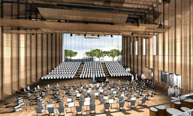
The positioning of the control rooms near the centre would have allowed the producers to work closely with the conductor, who is always in the centre of the room, regardless of the layout. In addition, a balcony in each studio means a large chorus could have been assembled either side of the orchestra, minimising the likelihood of players having to change positions.
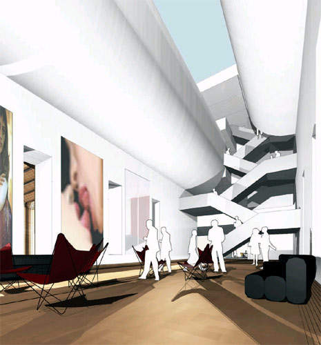
The drive towards greater compactness meant that the public access area would have been pushed below studio level. The public lobby will be an open but controlled space connected to the surrounding area, which will allow staff and people arriving for auditions to access the studio facilities.
Facilities
A small cafe, toilets, cloakroom and so on were to be provided for non-BBC users, with potential expansion room for a small cinema. Taking into account the difference in levels between White City Place and Wood Lane, this design would have been able to accommodate a foyer opening onto the public space while maintaining ground-level access to the studios.
There were to be two controlled access points from the foyer: one on the south side by the main facade, open to invited guests, and another which would allow musicians and BBC personnel access to the studios and the administrative and technical facilities (also, alternative access to the vertical circulation system to staff members and BBC card holders). The internal public area would have been located above the control rooms in the so-called musicians’ gallery.
The musicians’ gallery would have been a canyon-like space in between the studio boxes where the musicians can rest between sessions. A small kitchen supplies drinks and food for the exclusive use of the musicians and staff.
A 7.2m-wide bay along the north side of the Music Box would have hosted all the complementary facilities for the studios, including delivery and storage areas; music library; rehearsal room; rooms for soloists, conductors and musicians; rooms for visiting orchestras; and editing and technical rooms. The bay is situated above Studio 2, with a view over White City Place and the inner plaza.
This arrangement would have offered the most efficient and compact distribution of space for the studios and their complementary facilities. The administrative offices would have been located on top of Studio 1, overlooking the White City complex and the city skyline.
Communication is key
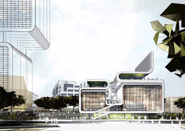
The aim was to make the Music Box an iconic part of the campus and to make an architectural statement that reflects the BBC’s cultural identity. As a building, the Music Box would have been dedicated to public involvement in and the production and broadcasting of musical activities. In the age of digital reproduction, the studio is probably the quintessential musical instrument, and the design for the music centre would have reflected this.
Music is a sequence of events in time; its physical notation implies a primarily linear structure – a ribbon or tape. The design of the Music Box alluded to this by using a folding band to envelope the main spaces in the building.
The core functions of the BBC are those of content provider and broadcaster. Like the BBC itself, the Music Box was intended to have a double function, dealing with technology as well as the needs of the public.
As a result, the design differentiates the façade functionally: windows for music production and screens for broadcasting are defined by the building’s ribbon-like folding band. The screens are formed by the sides of the loops – the usually blank walls of the acoustic box.
Conversely, the windows are framed by the ribbon’s loops, ensuring spatial continuity with the urban environment and establishing a direct visual link between the inner life of the Music Box and the public.
The BBC music centre – a broadcasting membrane
Two of the basic values of the BBC are transparency and creativity. The building design attempted to express these values directly by exposing and connecting the studio inside with the city outside through a glass membrane. Rather like being allowed backstage, passers-by would be able to get a glimpse of what is happening inside the building, while the musicians would feel as if they are playing to the city itself.
The southern wall of both studios was to be a sophisticated membrane, able to provide a variety of options for visual and acoustic conditions, so that the studios could be removed from public view if necessary. As a result, the studio acoustic was designed to operate perfectly, with a visually transparent glass surface on one side.
Depending on the specifics of future use, the studios may have needed to be more acoustically absorbent and visually opaque. Mechanisms were therefore planned that would have enabled the studios to adapt to a range of different conditions, depending on seasonal changes and the nature of the programmes. The system would have been able to offer this level of flexibility through a series of diaphragms that operate in tandem to produce a variety of visual and acoustic effects.
A triple glass skin, with an 800mm air chamber and a corrugated internal glass pane would have functioned as one of the studio walls. The first layer was to be fixed to the internal box and not connected to either the external structural box or the external glass skin. Another double-glazed, sealed membrane, placed at the edge of the opening, would have protected the internal membrane from street noise while ensuring an adequate level of climatic control.
If required, a ‘blackening’ curtain would have enabled the studios to function in complete darkness, isolated from the world outside. In between the corrugated glass layer and the double external membrane, there would have been a variable sun-shading curtain that protects the room from direct sunlight where necessary.
The ribbon surface would have been treated as a broadcasting device, producing a variety of multicoloured images both day and night. This skin would have taken the form of a rain-screen built from aluminium panels, covered with radiant mirror film, which produces iridescent reflections. During daylight hours, this would have created the illusion of a continuously changing colour screen.
Mounted behind the cladding, there would have been a grid of colour-changing LED lamps. These could be linked to a computer system that can turn pitch, rhythm and volume into changing digital patterns of colour and light via a sophisticated audio scan. In this way, the façade would have visually reproduced the music being played, creating a powerful architectural expression of the performances inside the studios.

