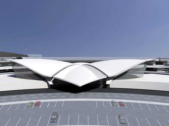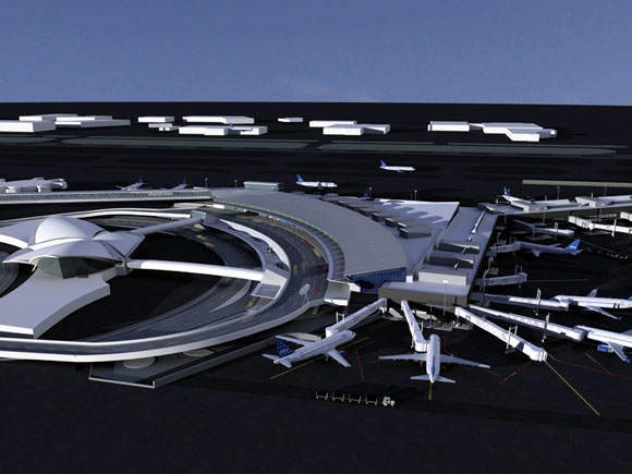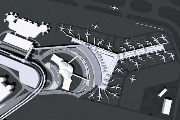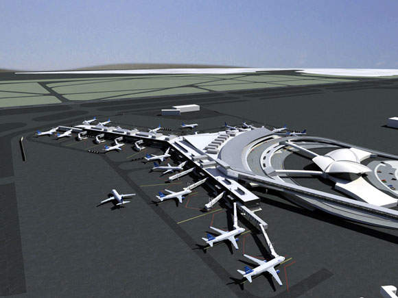
JetBlue has renovated the former TWA Terminal at John F Kennedy Airport in New York. The new Terminal 5 is a low-profile metal and glass structure providing 26 contact gates to handle an estimated 20m passengers a year. It accommodates 250 flights per day.
The construction of the new terminal commenced in 2005 and completed in October 2008. In 2005, Terminal 5 was included in a pane of twelve stamps which were supplied nationwide as the US Postal Service honoured masterworks of modern American architecture.
Terminal 5 is situated behind the Eero Saarinen terminal and is also connected to it through the passenger departure arrival tubes. These tubes also connect the building to the outlying gates.
JetBlue Terminal design
"Located opposite the former TWA terminal, the external design had to provide a subtle background and [acknowledge] the history of the landmark Eero Saarinan building," says Richard Smyth, vice president of redevelopment for JetBlue, "yet the inside will be very efficient, designed for today’s needs."
Of the nine design companies competing for the JetBlue terminal, global design, planning and strategic consulting firm Gensler stood out as being the most capable of understanding of how the personality and needs of a low-cost carrier could be translated into a low-cost terminal.
The resulting geometric lines and metal and glass of the new JetBlue Terminal will not challenge the soaring concrete curves of the iconic edifice. The 640,000ft² building will have 26 contact gates (twice the current number). Dual taxiways for each gate will increase efficiency to handle a projected 20m passengers passing through each year.
JetBlue terminal design concept
"JetBlue takes its customers across the country for as little as $99, and it does it in style," says Gensler’s design principal for the project, David Epstein. "So, for its new terminal, JetBlue wanted a building that reflected its commitment to service and efficiency."
So, how does a low-cost airline avoid delivering a low-quality product? And how does the carrier’s strategy translate into the design of the new terminal? "We place a strong emphasis on quality where the customer expects it," says Smyth. "We put dollars where passengers need them, such as providing enough restrooms and seating in the right places."
The company’s formula for success typically eschews the cheapest option in favour of cost-effectiveness. Its new aircraft, for example, are more reliable, and thus are cheaper on fuel and spend less time being repaired. Key elements of this philosophy were embedded within the design brief for the new terminal.
"We took our cue from JetBlue and were constantly considering costs," says Gensler’s managing principal for the project, Bill Hooper. "Some decisions involved a higher initial cost yet had a long-term cost advantage. This follows the same principle as the airline’s leather seats, which convey an image of luxury but are especially durable and quickly cleaned, making them more efficient than apparently cheaper options. For this same reason, we are currently looking at the most durable finishes to use as flooring material in the new terminal."
Cost considerations brought a discipline to the design that often resulted in the use of simpler, more flexible materials. For example, while similar buildings employ between 50 and 100 different types of light fixtures, the JetBlue Terminal uses just 17, all of which are commercially available.
The building uses what Hooper calls: "a very frugal palette of materials". It has an aluminium standing seam roof on the front and aluminium corrugated cladding on the airside exterior. Glass is used modestly, with no curtain walls – only storefront glass framing and ribbon windows on the perimeter in the holdrooms.
"We’ve used a minimalist approach, and the budget has been a constant sounding board, against which many of the decisions are made," continues Hooper, who is also an aviation security expert. "The post-9/11 period – especially last year – has been ridiculously hard for air carriers. This in turn clamps down on how we can re-interpret the terminal design. It requires a closer examination of the design priorities, [which must] not only accommodate the latest security requirements but also create an enjoyable and humane experience for passengers."
A major challenge for Gensler has been encouraging all parties involved to adapt their expectations and think in more radical terms. "They need to see this as a terminal the like of which they haven’t seen before," says Hooper. "As a firm, we approach terminal design from the inside out. If it functions well, it’s an architectural success. Great architecture comes from operational efficiency, and the most simple solution is often the most beautiful."
Structure
As well as acknowledging the importance of the iconic former TWA building, the design of the JetBlue Terminal is dictated by the flow of passengers. A greater number of Air Train passengers will arrive at the terminal from the north side, and this is reflected in the asymmetrical design, which will allow the building to accommodate the different loadings.
In place of a traditional, cathedral-like ticketing hall and check-in area, this low-profile terminal has lower ceilings with correspondingly lower costs.
The grand space is reserved for the concessions area, with its retail outlets, only lowering again at the departure gate. This establishes a sequence of environments in which passengers instinctively know where they are going and when they have arrived.
The design brief called for one common zone through which all outbound and arriving passengers could pass. This has been an efficient use of space as well as creating a feeling of excitement, triggered by the buzz of activity generated by people coming and going. To avoid unnecessary inter-mingling, which disrupts the flow, the concession stands are located on departing passengers’ right hand side, while arriving passengers, who are generally more interested in finding the toilets, find these positioned on their right hand side as they move in the opposite direction.
The focus on efficient passenger flows is a reflection of the need to cater to proportionally more passengers than any existing terminal worldwide.
JetBlue’s $550m bill for the terminal and airside utilities rises to $875m when roadways and parking facilities are included. JetBlue will reimburse the Port Authority of New York and New Jersey on a 30-year lease.
The design decisions behind this commercial venture are motivated by the bottom line, whereas the design for a civic building is motivated by a variety of considerations, such as passenger comfort and the need to make a statement about the city. "There are different trade-offs – a balance between customer convenience and revenue, passenger amenities and operational efficiency," admits Hooper. "Each type of client has different weightings in this evaluation process. JetBlue wants a faster payback for its investment than the port authority might accept."
"Within the brief, we have designed a new generation of airport terminals by adopting a more honest vocabulary and better use of budget. The look of the building is driven by a different design aesthetic, with a simple use of materials and an efficient flow of passengers the top priorities."
Finance
The main financiers for the new 26 contact gate terminal were the Port Authority which provided nearly $800m and JetBlue Airways. The bistate agency opened a six-level parking garage in the terminal with an investment of $82m, which accommodates more than 1,500 parking spaces connected to the air station.
Contractors
The main contractor was Arup who was involved in the planning and design management. The building engineering services, IT services, security and acoustics were also provided by Arup. The landside and the airside designer was DMJM Harris. The structural engineer was Ammann & Whitney. The interior architect was Rockwell Group. The construction management was provided by Turner and the baggage handling consultant was BNP Associates.


